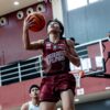
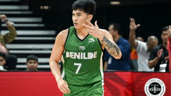
Now, we decided to turn it up a notch, With the country’s premier collegiate league and the grand old league both back in action, we deemed it best to come up with a list featuring schools from both associations this time.
So, here are the eight uniforms No Cap believes are the best looking among the rest of the field, pound for pound.
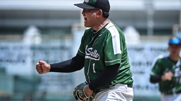
8. DE LA SALLE UNIVERSITY
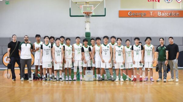
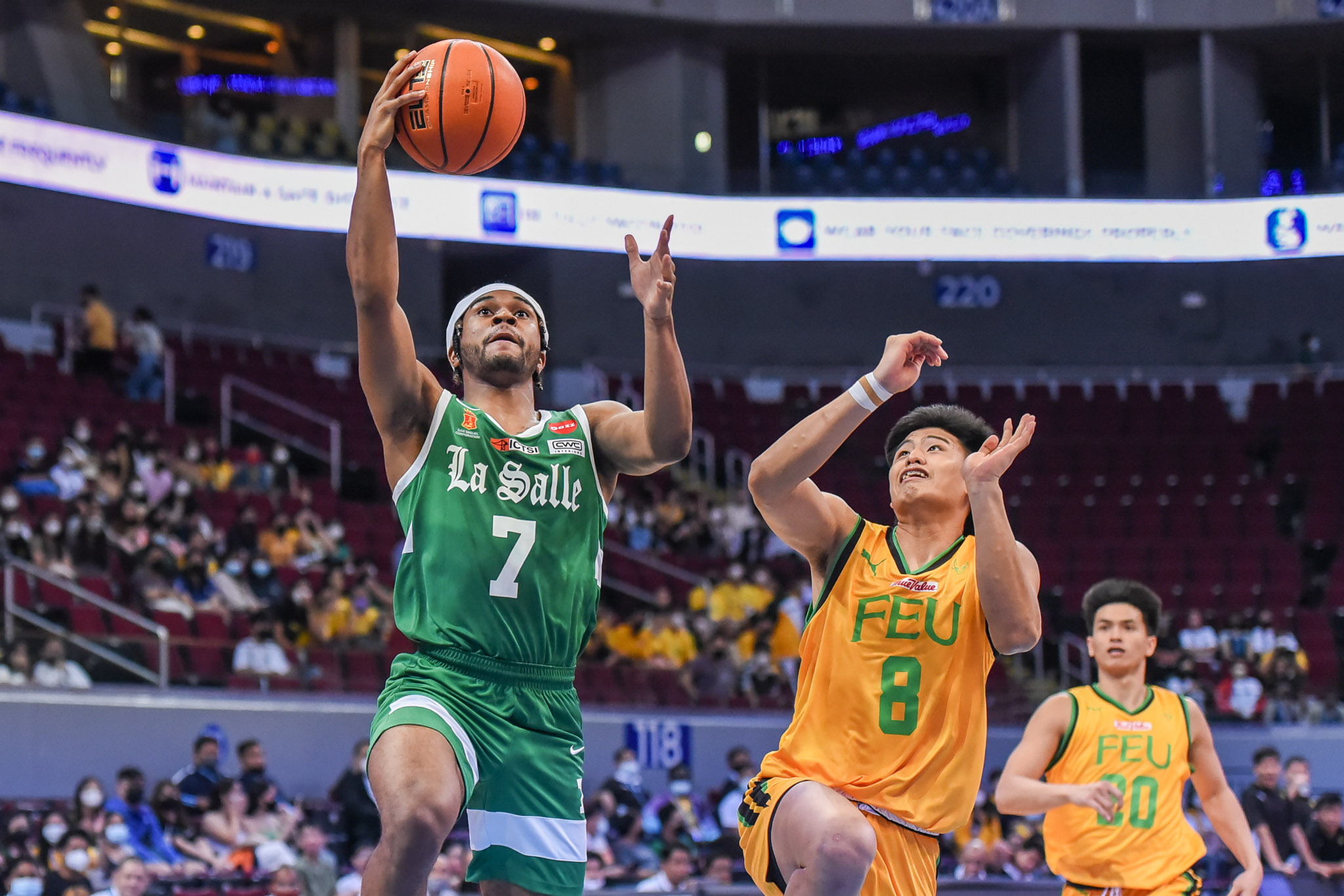 Some may not agree with this pick. Why include a team that wears the very same set from last season? But for us, it’s simple: If it ain’t broke, don’t fix it.
De La Salle University is back with the Nike Fadeaway threads, and it remains a beauty with how all the elements — from the Old English ‘La Salle” on the front and the block font on names and numbers — complement one another.
We wouldn’t really mind if the Green Archers embrace this very look for years to come. After all, they remain the only Swoosh-backed team in the UAAP, so gone are the days when three schools practically wear the same uniforms.
7. NATIONAL UNIVERSITY
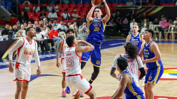
 From the looks of it, National University has come up with a standard design for all of its basketball teams’ uniforms since 2019, with the only distinction being in the side panels undergoing tweaks every new UAAP season.
We aren’t initially a fan of the Bulldogs’ kits mainly because of the basic-looking font used for the school’s name on the chest, but it’s starting to grow on us now as we appreciate having a look that’s becoming an identity.
We appreciate, too, the classic two-tone pipings that surprisingly paired up nicely with their modern-looking side panels than last season’s.
6. COLLEGE OF ST. BENILDE
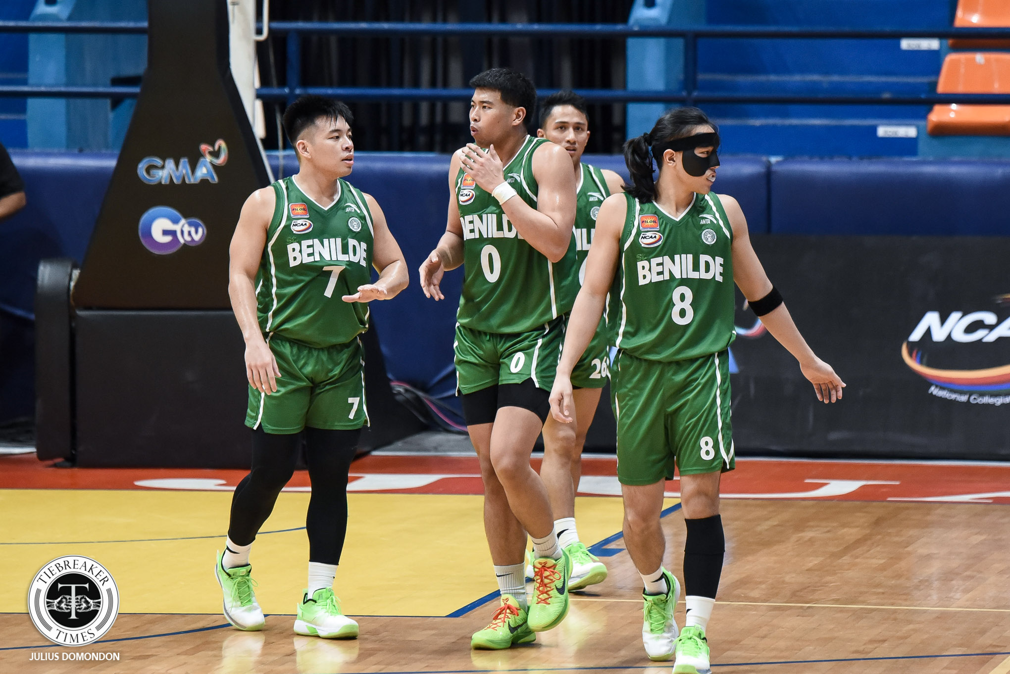 Big thanks to Anta, College of St. Benilde is now wearing one of the best jerseys of today that bears the very same design forever etched in school lore.
The Blazers are clad in kits inspired by the ones worn by the Sunday Salvacion-powered squad that ruled the NCAA men’s basketball wars in 2000, which to this day remains CSB’s lone championship in the Grand Old League.
What makes the current set different is that it’s made up of the school’s green and white colors — past Benilde squads wore black kits, as they weren’t allowed to wear green. A perfect connection of the past to the present.
5. FAR EASTERN UNIVERSITY
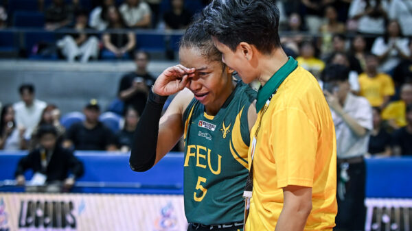
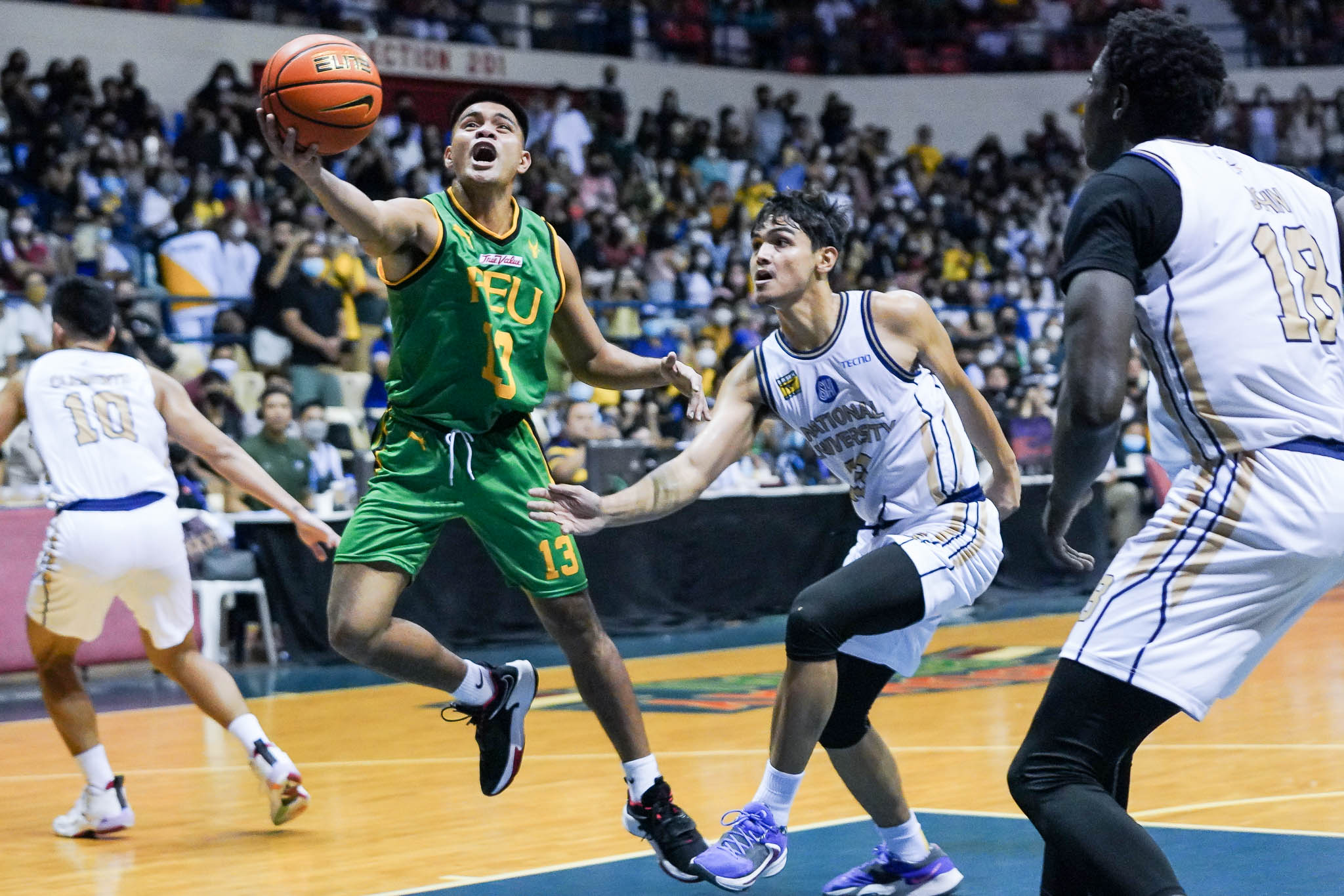 We’ve been hearing mixed reactions about Far Eastern University’s new jerseys by Puma, most of which say that they aren’t fans of the green shade. And we can’t blame them, since the Tamaraws sported a darker tone for years.
But the current green, as odd as it may seem for some, is no longer new. That kind of hue was a tad similar to the ones the cagers from Morayta had in their kits back in 2010, when the program was still under long-time partner Nike.
If you ask us, the current threads are way better than last season’s. We also like the incorporation of black trims in both the light and dark jerseys, similar to FEU’s gold unis back in Season 74 as it had black strips within the panels.
4. LYCEUM OF THE PHILIPPINES UNIVERSITY
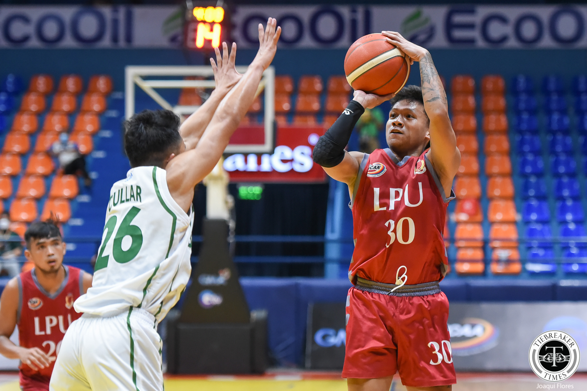 Simple, yet so appealing. And all that Lyceum of the Philippines did was by changing the colors of the names and numbers from grey to white.
Yes. Nothing major was made in the Pirates’ jerseys for the new NCAA season except that switch, and it proved to be the best decision as “LPU” as well as the players’ names popped out in their red and gray uniforms.
Another reason why it caught our attention is it reminded us of the uniforms worn by Lebanon in its historic run in the last FIBA Asia Cup in Jakarta. The resemblance is striking — just check those horizontal bars on the sides.
3. SAN BEDA UNIVERSITY
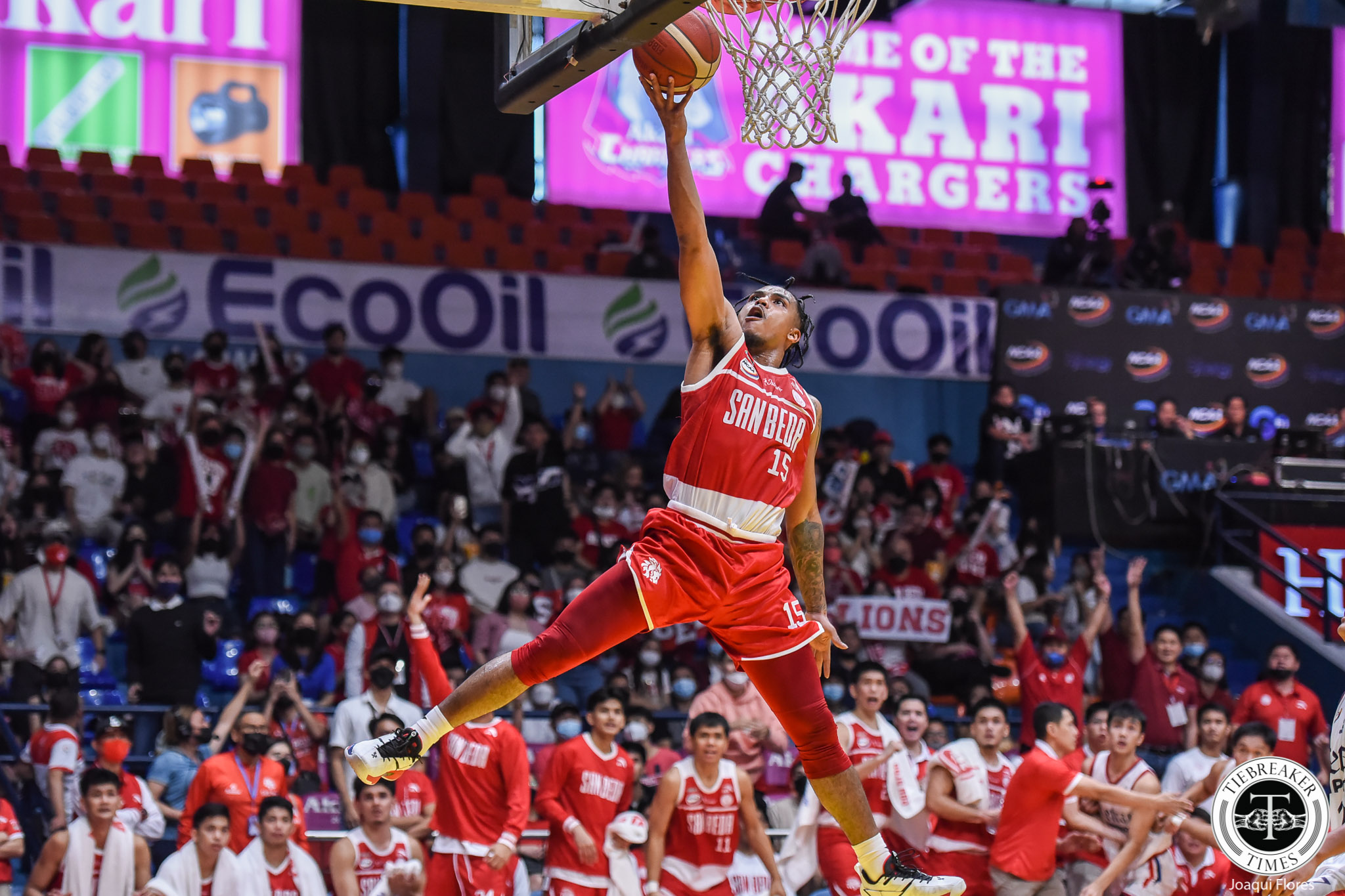 There’s really no shortage of inspiration to draw from for Anta in creating San Beda’s jerseys for the NCAA Season 98 wars, and it ultimately decided to go way back by choosing the threads worn by the 1977 championship team.
Yes, the same uniforms donned by greats Chito Loyzaga and Frankie Lim. From the eye-catching “SAN BEDA” on the front, to the unique balance of red and white, it sure is a welcome sight to see at a time some kits’ designs go over.
We feel, though, that it would’ve been perfect had the Chinese brand gone with a top tank-like cut to make the jerseys retro in every sense of the term. But we’re not complaining. It’s still a thing of beauty, no doubt.
2. UNIVERSITY OF SANTO TOMAS
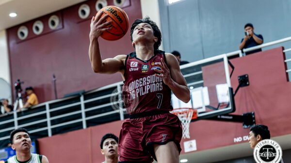
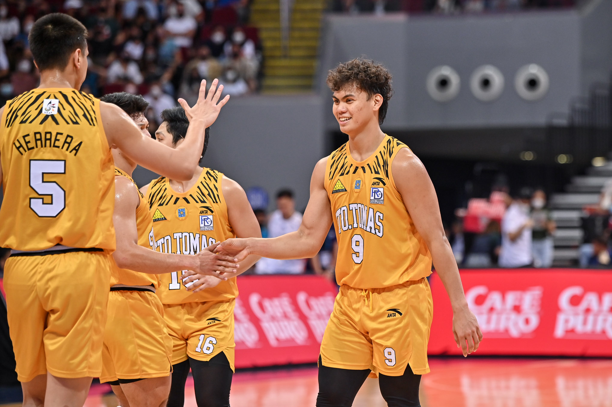 Like with San Beda’s uniforms, we feel that University of Santo Tomas kits would be the best this season had Anta retained the slim cut.
But it doesn’t mean we don’t like it already. In fact, we love it, mainly because of the tiger print’s return after many seasons. Under the Varsity Project as well, the jerseys are a nod to the team that ruled the UAAP in 1994-95.
There are tons of designs from past UST championship teams’ kits to choose from, but the brand went with the ones worn by the team spearheaded by the decorated Bal David, who’s now handling the Growling Tigers program.
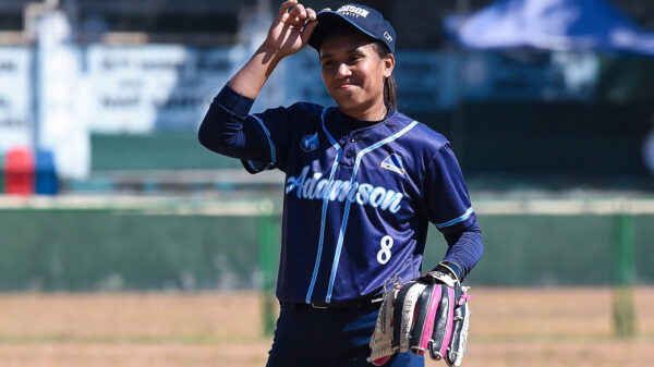
1. ADAMSON UNIVERSITY
 In our previous UAAP jersey rankings, Adamson University earned the no. 2 spot because of the unique kits Anta made for them. And back then, we hoped that both camps would explore deeper into the school’s history.
Thus, the elation on our part to see it come into fruition. The Soaring Falcons are now wearing throwback jerseys of the 1977 team led by Hector Calma, which remains the only batch to give AdU a UAAP gold medal.
The threads feature the school’s name warped circularly, with the numbers at the center. It would’ve been perfect had they been allowed to wear mismatching blue-and-white unis like Calma and Co., but UAAP rules do not, sadly.
Still, for us, this is easily the cream of the crop of the Varsity Project. And they truly deserve to be given that kind of love through beautiful jerseys, since it’s through Adamson that Anta made its way back to college hoops after years.

